Color Theory in Web Design: How to Choose the Right Palette for Your Brand
Color is a powerful tool in web design. It sets the tone, evokes emotions, and helps define a brand’s identity. Understanding color theory and how to choose the right color palette for your brand is crucial for creating a cohesive and visually appealing website. In this blog post, we’ll explore the fundamentals of color theory, its psychological impact, and practical tips for selecting the perfect color palette for your brand.
The Basics of Color Theory
Color theory is the science and art of using color. It explains how colors interact, how they are perceived, and how they can be combined to create visually harmonious designs. The foundation of color theory lies in the color wheel, which organizes colors into a circular format, illustrating the relationships between primary, secondary, and tertiary colors.
- Primary Colors: Red, blue, and yellow. These are the base colors that cannot be created by mixing other colors.
- Secondary Colors: Green, orange, and purple. These are created by mixing two primary colors.
- Tertiary Colors: Colors created by mixing a primary color with a neighboring secondary color.
Understanding the relationships between these colors can help designers create balanced and aesthetically pleasing color schemes.
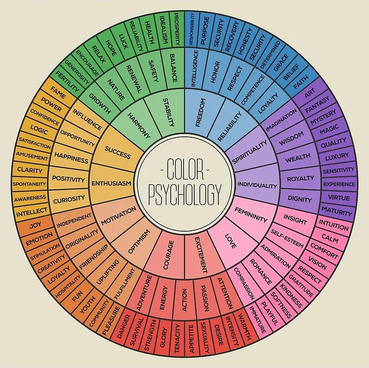
The Psychological Impact of Colors
Colors have the power to evoke emotions and convey messages, which is why they play a crucial role in branding and web design. Here are some common associations with colors:
- Red: Passion, energy, urgency, excitement. Often used for call-to-action buttons.
- Blue: Trust, calmness, professionalism. Commonly used in corporate and tech industries.
- Green: Growth, nature, health, tranquility. Often associated with eco-friendly and wellness brands.
- Yellow: Happiness, optimism, warmth. Used to grab attention and convey friendliness.
- Purple: Luxury, creativity, wisdom. Often associated with high-end products and brands.
- Orange: Enthusiasm, friendliness, creativity. Used for attention-grabbing elements.
- Black: Sophistication, elegance, power. Common in luxury brands and fashion.
- White: Purity, simplicity, cleanliness. Often used for minimalistic and modern designs.
Understanding these psychological effects can help in choosing colors that align with your brand’s message and values.
Choosing the Right Color Palette for Your Brand
- Understand Your Brand Identity
Before selecting a color palette, it’s essential to have a clear understanding of your brand identity. What are your brand’s values, mission, and personality? For example, a law firm might want to convey professionalism and trust, making blue an appropriate choice. A children’s toy company, on the other hand, might opt for bright and cheerful colors like yellow and orange. - Consider Your Target Audience
The preferences and cultural backgrounds of your target audience can significantly influence your color choices. Different cultures associate colors with different meanings. For example, while white symbolizes purity in many Western cultures, it can represent mourning in some Eastern cultures. Understanding your audience’s cultural context and preferences can help you choose colors that resonate with them. - Create a Color Scheme
Once you’ve identified your brand’s identity and audience, you can start creating a color scheme. There are several types of color schemes to consider:- Monochromatic: Uses different shades, tints, and tones of a single color. This creates a harmonious and cohesive look but can lack contrast.
- Analogous: Uses colors that are next to each other on the color wheel. This scheme is pleasing to the eye and creates a serene and comfortable design.
- Complementary: Uses colors that are opposite each other on the color wheel. This scheme creates a high-contrast, vibrant look but should be used carefully to avoid overwhelming the viewer.
- Triadic: Uses three colors that are evenly spaced around the color wheel. This scheme provides a balanced and harmonious look with a bit more variety.
- Use Contrast Wisely
Contrast is crucial for readability and drawing attention to specific elements. Ensure that there is sufficient contrast between the text and background colors to make your content easily readable. Tools like the WebAIM Contrast Checker can help ensure your color choices meet accessibility standards. - Test Your Palette
Once you’ve chosen your colors, test them in different contexts and on various devices. Colors can look different on screens, so it’s essential to ensure consistency and legibility. Consider how your colors work together in different scenarios, such as on call-to-action buttons, backgrounds, and navigation elements. - Be Consistent
Consistency in color usage is vital for brand recognition. Use your chosen color palette consistently across all your brand’s touchpoints, including your website, social media, and marketing materials. This helps build a cohesive and recognizable brand identity.
Conclusion
Choosing the right color palette for your brand is a crucial aspect of web design that can significantly impact how your audience perceives your brand. By understanding color theory, considering your brand identity and target audience, and using contrast effectively, you can create a visually appealing and cohesive design. Remember, color is more than just an aesthetic choice—it’s a powerful tool that can convey emotions, build brand recognition, and enhance user experience.