NOW ACCEPTING NEW CLIENTS

Author: admin

The Power of Minimalism: How Less Can Be More in Web Design

In a world overflowing with information, the beauty of simplicity is often overlooked. Minimalism in web design is more than just a trend—it’s a philosophy that focuses on clarity, functionality, and user experience. By removing unnecessary elements and prioritizing what’s essential, minimalist designs create a sense of calm and purpose that resonates with users. In this blog post, we’ll explore the power of minimalism in web design and how less can indeed be more.

What is Minimalist Web Design?

Minimalist web design embraces simplicity by stripping away excess and focusing on the most critical elements of a site. This approach uses clean layouts, ample white space, limited color palettes, and purposeful typography. The goal is to remove distractions, allowing users to focus on the content and experience a smoother, more intuitive interaction with the site.

The Benefits of Minimalist Web Design

  1. Improved User Experience
    By focusing only on the essentials, minimalist web design reduces clutter and simplifies navigation. Users can easily find the information they’re looking for without being overwhelmed by unnecessary features. This creates a more seamless and enjoyable browsing experience, which can lead to higher engagement and conversions.
  2. Faster Loading Times
    Minimalist websites typically load faster because they rely on fewer elements, such as images, scripts, and plugins. Faster loading times are crucial for user satisfaction and SEO, as search engines prioritize sites with quick load speeds. With minimalism, you reduce the risk of users leaving your site due to slow performance.
  3. Clear Communication of Brand Message
    In minimalist design, every element serves a purpose. By focusing on the essentials, your brand’s message is communicated more clearly. There’s no visual noise to distract users from your content, call to action, or brand values. This helps create a lasting impression and strengthens your brand identity.
  4. Enhanced Visual Appeal
    Minimalist designs are often visually striking due to their simplicity and elegance. The use of white space, clean lines, and balanced layouts draws attention to the most important elements. This not only creates a sense of sophistication but also ensures that each element stands out.
  5. Better Mobile Compatibility
    Minimalist designs translate well to mobile devices. With fewer elements to manage, responsive designs become more intuitive and adaptable to different screen sizes. A clean, minimal layout ensures that mobile users experience the same level of clarity and functionality as desktop users.

Key Principles of Minimalist Web Design

  1. Focus on Essential Elements
    Minimalist web design is all about intentionality. Before adding any element to your design, ask yourself: “Is this necessary?” Keep only the most important features, such as core content, key navigation items, and essential visuals. Eliminate anything that does not contribute directly to the user’s goals or your brand’s message.
  2. Use White Space Wisely
    White space (or negative space) is one of the defining characteristics of minimalist design. It’s the empty space around elements that allows them to breathe and stand out. White space not only creates a sense of balance but also enhances readability and focus. Don’t be afraid to leave areas of your design empty—this helps guide the user’s eye toward what matters most.
  3. Limit Your Color Palette
    Minimalist designs often use a restrained color palette, usually consisting of two or three colors. Neutral tones like black, white, and gray are commonly used, with an accent color to highlight key elements such as buttons or calls to action. By limiting your colors, you can create a more cohesive and harmonious visual experience.
  4. Embrace Simple Typography
    Typography plays a crucial role in minimalist design. Opt for clean, readable fonts and use a limited number of font styles and sizes. The goal is to make your text easy to read and understand without overwhelming users with too many typefaces or unnecessary flourishes. A well-chosen font can enhance the overall aesthetic while maintaining clarity.
  5. Prioritize Functionality
    Functionality is at the core of minimalist web design. Each element should serve a specific purpose, and the user interface should be intuitive and easy to navigate. Clear calls to action, straightforward navigation menus, and simple forms all contribute to a more user-friendly experience.
  6. Use High-Quality Visuals Sparingly
    In minimalism, visuals should be purposeful and of high quality. Instead of filling your site with multiple images or videos, use a few strong visuals that support your brand message. These visuals should have a clear focus and serve to enhance the user experience rather than distract from it.

Examples of Minimalism in Web Design

  • Apple: Apple’s website is a prime example of minimalist design. The clean layout, ample white space, and clear product images allow users to focus on the products without distractions. The navigation is simple, and the use of typography and visuals reflects Apple’s sleek and modern brand identity.
  • Airbnb: Airbnb uses minimalism to create a clean, intuitive interface. The design prioritizes large, high-quality visuals of properties and destinations, with simple navigation and a restrained color palette. The minimal design allows users to focus on finding their ideal stay.

Conclusion

Minimalism in web design isn’t just about aesthetics—it’s about enhancing user experience, clarity, and brand communication. By focusing on the essentials, using white space effectively, and simplifying your design elements, you can create websites that are not only visually appealing but also functional and intuitive. In a world filled with digital clutter, minimalism provides a refreshing and effective way to engage your audience.

Remember: sometimes, less really is more.

Designing for Mobile: Tips and Best Practices for Responsive Web Design

In today’s digital landscape, mobile devices are a primary means of accessing the internet. With over half of global web traffic coming from mobile devices, designing for mobile is no longer optional—it’s essential. Responsive web design ensures that your website provides a seamless user experience across all devices, from desktops to smartphones. In this blog post, we’ll explore tips and best practices for designing responsive websites that look and function beautifully on any screen size.

What is Responsive Web Design?

Responsive web design is an approach that allows web pages to adapt to the screen size and orientation of any device. This is achieved through flexible grids, fluid layouts, and media queries. The goal is to provide an optimal viewing experience, whether a user is accessing your site on a desktop monitor, a tablet, or a smartphone.

Tips and Best Practices for Responsive Web Design

  1. Adopt a Mobile-First Approach
    Designing with a mobile-first mindset means starting your design process with the smallest screen size and progressively enhancing the experience for larger screens. This approach ensures that your core content and features are prioritized and accessible on mobile devices. Once you have a solid mobile design, you can expand and enhance it for larger screens.
  2. Use a Fluid Grid Layout
    Fluid grids allow your design elements to resize proportionally based on the screen size. Unlike fixed layouts that have specific pixel widths, fluid grids use relative units like percentages. This flexibility ensures that your layout adjusts smoothly to different screen sizes, maintaining a consistent look and feel.
  3. Implement Flexible Images and Media
    Images and media should also be flexible to ensure they scale properly across different devices. Use CSS properties like max-width: 100% to make images responsive. This ensures that images do not exceed the width of their container, preventing overflow issues on smaller screens.
  1. Utilize Media Queries
    Media queries are a fundamental part of responsive design. They allow you to apply different styles based on the characteristics of the user’s device, such as screen width, height, orientation, and resolution. Use media queries to adjust layout, typography, and other design elements to create a tailored experience for different devices.
    css
@media only screen and (max-width: 768px) {
    /* Styles for tablets and mobile devices */
}

@media only screen and (min-width: 769px) {
    /* Styles for desktops and larger devices */
}
  1. Prioritize Touch-Friendly Design
    Mobile users primarily interact with websites through touch gestures. Ensure that buttons, links, and interactive elements are large enough to be easily tapped. Aim for a touch target size of at least 44×44 pixels, as recommended by Apple. Provide sufficient spacing between touch targets to prevent accidental taps.
  2. Optimize Typography for Readability
    Typography plays a crucial role in mobile design. Use legible fonts and appropriate font sizes to ensure readability on small screens. A base font size of 16px is a good starting point. Additionally, use relative units like em or rem for font sizes to ensure scalability and consistency across different devices.
  3. Simplify Navigation
    Navigation on mobile devices should be intuitive and straightforward. Consider using a collapsible menu (commonly known as a “hamburger” menu) to save screen space. Ensure that the navigation is easy to access and operate with touch gestures. Clear and concise labels for navigation items enhance usability.
  4. Optimize Loading Times
    Mobile users expect fast loading times. Optimize your website’s performance by minimizing HTTP requests, compressing images, and using efficient coding practices. Tools like Google PageSpeed Insights can help you identify areas for improvement and provide recommendations for optimizing loading times.
  5. Test Across Multiple Devices
    Testing is a critical part of responsive web design. Test your website on a variety of devices and screen sizes to ensure a consistent and functional experience. Use both physical devices and browser-based testing tools like BrowserStack or Responsinator to check how your design performs across different platforms.
  6. Leverage Mobile-Specific Features
    Take advantage of mobile-specific features to enhance the user experience. This includes integrating touch gestures, using geolocation for personalized content, and implementing mobile-specific call-to-actions like “tap to call” or “tap to navigate.”

Conclusion

Designing for mobile is an essential aspect of modern web development. By adopting a mobile-first approach, using fluid grids, implementing flexible images, and optimizing for touch interactions, you can create responsive websites that provide an exceptional user experience across all devices. Remember, the key to successful responsive design is to prioritize usability and accessibility, ensuring that your content is easily accessible and enjoyable for every user, regardless of the device they use.

Color Theory in Web Design: How to Choose the Right Palette for Your Brand

Color is a powerful tool in web design. It sets the tone, evokes emotions, and helps define a brand’s identity. Understanding color theory and how to choose the right color palette for your brand is crucial for creating a cohesive and visually appealing website. In this blog post, we’ll explore the fundamentals of color theory, its psychological impact, and practical tips for selecting the perfect color palette for your brand.

The Basics of Color Theory

Color theory is the science and art of using color. It explains how colors interact, how they are perceived, and how they can be combined to create visually harmonious designs. The foundation of color theory lies in the color wheel, which organizes colors into a circular format, illustrating the relationships between primary, secondary, and tertiary colors.

  • Primary Colors: Red, blue, and yellow. These are the base colors that cannot be created by mixing other colors.
  • Secondary Colors: Green, orange, and purple. These are created by mixing two primary colors.
  • Tertiary Colors: Colors created by mixing a primary color with a neighboring secondary color.

Understanding the relationships between these colors can help designers create balanced and aesthetically pleasing color schemes.

The Psychological Impact of Colors

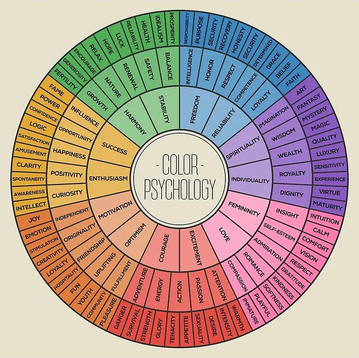
Colors have the power to evoke emotions and convey messages, which is why they play a crucial role in branding and web design. Here are some common associations with colors:

  • Red: Passion, energy, urgency, excitement. Often used for call-to-action buttons.
  • Blue: Trust, calmness, professionalism. Commonly used in corporate and tech industries.
  • Green: Growth, nature, health, tranquility. Often associated with eco-friendly and wellness brands.
  • Yellow: Happiness, optimism, warmth. Used to grab attention and convey friendliness.
  • Purple: Luxury, creativity, wisdom. Often associated with high-end products and brands.
  • Orange: Enthusiasm, friendliness, creativity. Used for attention-grabbing elements.
  • Black: Sophistication, elegance, power. Common in luxury brands and fashion.
  • White: Purity, simplicity, cleanliness. Often used for minimalistic and modern designs.

Understanding these psychological effects can help in choosing colors that align with your brand’s message and values.

Choosing the Right Color Palette for Your Brand

  1. Understand Your Brand Identity
    Before selecting a color palette, it’s essential to have a clear understanding of your brand identity. What are your brand’s values, mission, and personality? For example, a law firm might want to convey professionalism and trust, making blue an appropriate choice. A children’s toy company, on the other hand, might opt for bright and cheerful colors like yellow and orange.
  2. Consider Your Target Audience
    The preferences and cultural backgrounds of your target audience can significantly influence your color choices. Different cultures associate colors with different meanings. For example, while white symbolizes purity in many Western cultures, it can represent mourning in some Eastern cultures. Understanding your audience’s cultural context and preferences can help you choose colors that resonate with them.
  3. Create a Color Scheme
    Once you’ve identified your brand’s identity and audience, you can start creating a color scheme. There are several types of color schemes to consider:
    • Monochromatic: Uses different shades, tints, and tones of a single color. This creates a harmonious and cohesive look but can lack contrast.
    • Analogous: Uses colors that are next to each other on the color wheel. This scheme is pleasing to the eye and creates a serene and comfortable design.
    • Complementary: Uses colors that are opposite each other on the color wheel. This scheme creates a high-contrast, vibrant look but should be used carefully to avoid overwhelming the viewer.
    • Triadic: Uses three colors that are evenly spaced around the color wheel. This scheme provides a balanced and harmonious look with a bit more variety.
  4. Use Contrast Wisely
    Contrast is crucial for readability and drawing attention to specific elements. Ensure that there is sufficient contrast between the text and background colors to make your content easily readable. Tools like the WebAIM Contrast Checker can help ensure your color choices meet accessibility standards.
  5. Test Your Palette
    Once you’ve chosen your colors, test them in different contexts and on various devices. Colors can look different on screens, so it’s essential to ensure consistency and legibility. Consider how your colors work together in different scenarios, such as on call-to-action buttons, backgrounds, and navigation elements.
  6. Be Consistent
    Consistency in color usage is vital for brand recognition. Use your chosen color palette consistently across all your brand’s touchpoints, including your website, social media, and marketing materials. This helps build a cohesive and recognizable brand identity.

Conclusion

Choosing the right color palette for your brand is a crucial aspect of web design that can significantly impact how your audience perceives your brand. By understanding color theory, considering your brand identity and target audience, and using contrast effectively, you can create a visually appealing and cohesive design. Remember, color is more than just an aesthetic choice—it’s a powerful tool that can convey emotions, build brand recognition, and enhance user experience.

The Importance of Accessibility in Web Design: Making Your Website Inclusive for All

In today’s digital age, the internet is an essential resource in many aspects of life, from education and employment to social interactions and shopping. As web designers, it’s our responsibility to ensure that the websites we create are accessible to everyone, regardless of their abilities or disabilities. Accessibility in web design isn’t just about compliance with legal standards—it’s about inclusivity, user experience, and reaching a broader audience.

What is Web Accessibility?

Web accessibility refers to the inclusive practice of removing barriers that prevent people with disabilities from interacting with or accessing websites. This includes people with visual, auditory, motor, and cognitive impairments. An accessible website ensures that all users, regardless of their physical or cognitive abilities, can navigate, understand, and interact with the web content.

Why is Accessibility Important?

  1. Inclusivity and Equal Access
    The internet is a public resource, and everyone should have equal access to it. By designing accessible websites, we ensure that all individuals, including those with disabilities, can access information and services. This inclusivity is a fundamental principle of social justice and equity.
  2. Legal Compliance
    Various laws and regulations mandate web accessibility, including the Americans with Disabilities Act (ADA) in the United States and the Web Content Accessibility Guidelines (WCAG) developed by the World Wide Web Consortium (W3C). Non-compliance can lead to legal ramifications, including lawsuits and fines. Therefore, ensuring accessibility is not just a moral obligation but also a legal one.
  3. Improved User Experience
    Accessible design often results in a better overall user experience for all users, not just those with disabilities. For example, providing clear and easy-to-navigate interfaces, good color contrast, and readable fonts can make a website more user-friendly for everyone. Additionally, features like captions and transcripts benefit not only individuals with hearing impairments but also those in noisy environments or who prefer to read content.
  4. Expanded Audience Reach
    An accessible website reaches a broader audience, including the approximately 1 billion people worldwide who live with some form of disability. By ignoring accessibility, businesses and organizations may exclude a significant portion of potential users or customers. Inclusive design opens up new markets and opportunities for engagement.
  5. SEO Benefits
    Many accessibility features overlap with best practices for search engine optimization (SEO). For example, providing alt text for images helps search engines understand and index content, potentially improving search rankings. Additionally, clear and structured content, which aids screen readers, also helps search engines crawl and index the site more effectively.

Key Principles of Accessible Web Design

To create an accessible website, consider the following key principles:

  1. Perceivable: Ensure that users can perceive the information being presented. This includes providing text alternatives for non-text content, such as images, videos, and audio files. Use appropriate color contrasts and text sizes to aid readability.
  2. Operable: Make sure that all users can navigate and interact with the site. This includes keyboard accessibility for users who cannot use a mouse, as well as providing sufficient time for users to read and interact with content.
  3. Understandable: Content and navigation should be easy to understand. Use clear, concise language and provide instructions where necessary. Avoid overly complex layouts and jargon.
  4. Robust: The website should be compatible with various assistive technologies, such as screen readers. This includes using semantic HTML, providing ARIA (Accessible Rich Internet Applications) landmarks and roles, and ensuring the site works across different browsers and devices.

Conclusion

Accessibility in web design is not an optional feature; it’s a necessity. By prioritizing accessibility, we create a more inclusive digital world where everyone has the opportunity to participate fully. Whether driven by ethical considerations, legal requirements, or the desire to reach a wider audience, the benefits of accessible design are clear. As web designers, we have the power and responsibility to make the internet a better place for everyone. Let’s embrace accessibility and build a web that’s inclusive for all.